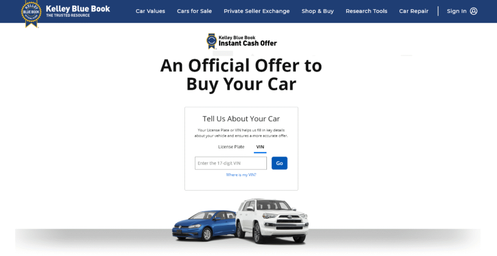
Kelley Blue Book desired a process of buying user’s cars sight unseen and give them an offer online after a fairly short painless set of questions.

The Challenge
The Instant Cash Offer experience is one of the most important flows at Kelley Blue Book. People are often stressed, unsure about their car’s condition, and worried about getting a fair offer.
The challenge was to help users confidently enter the right information about their vehicle—especially damage—without overwhelming them or causing confusion. We needed the experience to feel simple and trustworthy, while still collecting accurate data that directly impacts the offer.
Research & Insights
We looked closely at where people were struggling in the flow. Users hesitated when asked about vehicle condition, often because they didn’t know how to describe damage or weren’t sure what “counted.”
A few key insights stood out:
- People think visually, not in automotive terminology
- Text-only questions led to second-guessing and inconsistent answers
- Users wanted reassurance that they were being honest, not penalized
- Damage location mattered more than detailed descriptions
This made it clear that we needed a more visual, guided way for people to assess their vehicle.

The Solution
We redesigned how users enter vehicle information, focusing on clarity and confidence instead of technical detail.
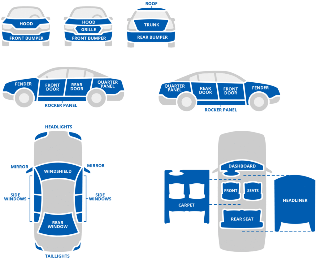
One of the core improvements was introducing interactive vehicle illustrations for each vehicle category. Instead of asking users to describe damage in words, we showed them a visual representation of their vehicle and let them tap or select where damage existed.
- Matched different vehicle types (sedan, SUV, truck, etc.)
- Highlighted specific areas so users could easily identify damage locations
- Reduced ambiguity by turning a judgment call into a simple interaction
- All illustrations were interactive. User clicked on area with damage and could describe it.

Interactive condition area images all drawn by me
In addition to the interactive illustrations, we streamlined the information entry flow to feel more conversational and less like a form. We added templates to ease the task of uploading photos, The goal was to help users move forward with confidence, not stop and reconsider every answer.

Results & Impact
The updated experience made it easier for users to complete the Instant Cash Offer flow without hesitation. People were more confident entering their information, which led to more consistent condition reporting.
- Business perspective: the clearer input resulted in better-quality data and fewer surprises later in the process.
- User perspective: the experience felt more transparent and fair—users understood how their answers connected to their offer.
The interactive illustrations became a defining part of the flow and helped differentiate the Instant Cash Offer experience from competitors. Other illustrations defined how the process works.

Reflection
One of the biggest lessons from this project was how powerful visual guidance can be in high-stress moments. By replacing text-heavy inputs with simple, interactive visuals, we reduced cognitive load and built trust at the same time.
If we were to revisit the work, we’d look at expanding the illustrations even further—adding more context or micro-feedback to help users feel even more confident about their selections. Overall, the project reinforced the value of meeting users where they are and designing for how people actually think, not how systems expect them to behave.
Please reach out to me for more details.